What is uxbits?
- Low-fidelity tangible solutions for everyday annoyances.
- UX, in minutes.
Feedbacks are always welcomed - hence the low fidelity aspect of the designs.
Airline Seat Selection: But Better
Get hot too quickly? Or are you sensitive to heat/sunlight?
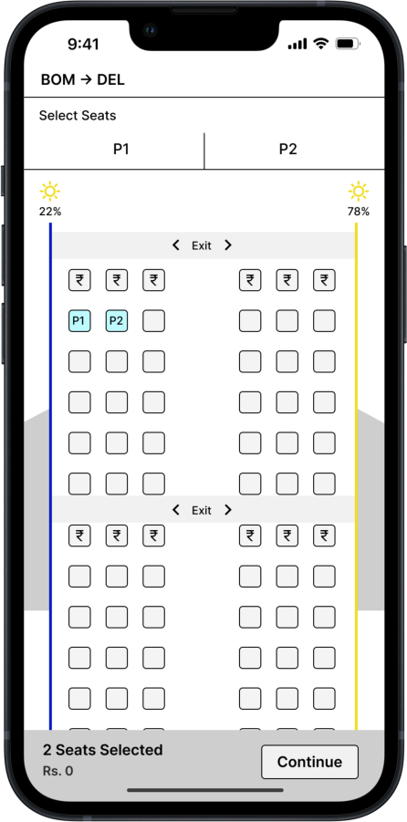
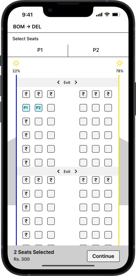
Add a visual cue which indicates where the sun will be, while selecting seats through airline app/website. In this case, blue for cool side and yellow for sunny side.
The flight will change direction, so perhaps add how long either sides may have sun facing it. Note the % of sun just above the coloured walls.
The cooler side can be monetized for profit. Note the second picture, the seats on the left (or cool) side are chargeable.
With accessibility x frustration in mind, this solution helps users with photosensitivity and those who just prefer not to bath in sunlight. This also opens opportunity for extra source of income for airlines.
Gamifying Low Battery Notification
Dismissed the low battery warning and forgot about it?
Add a persistant notification which stays on the screen indicating it's really time to put the laptop to charge.
[1/2] Intrusive notification: Inspired by video games, have the edge of the screen bleed into the display(with or without blurring the entire display), indicating the critical battery level.
[2/2] Non-intrusive notification: Have a countdown pop onto the screen. Give less time to create sense of urgency, but just enough time for the user to rush and plug in the laptop.
If the video doesn't load, then reload page. YouTube Bug.

